I was putsying around my store SS Home and noticed my 6’8″ assistant Zacary waiting on a couple. All my customers loved Zac, particularly the women. Why I remember this part, I don’t know but I had on a pale pink Juicy Couture sweatsuit, the one with the fold down waistline. Funny the things we remember. Anyway, Zacary and the couple were talking rather intently and it appeared extra help was needed so I went over and introduced myself. The woman, slim and attractive in her early sixties, said she had tried several times to reach me for design services…I hadn’t gotten her messages. She said I was just about to give up on you. Her husband added, but we’ve found you now.

This was the beginning of a very satisfying design project but more importantly it was the beginning of a lasting friendship. Charlene and John have been my best friends for over three years now. They literally got me through the toughest days after losing my darling Jim. Last November Charlene took me to her townhouse in Cape Cod. Just the two of us. We went to church jumble sales where I scored the most beautiful dried hydrangeas. Shipped them home! We went to a nearby historic tea house and had proper tea with scones, clotted cream, and berries. We dined out, often at the restaurant’s bar near a fireplace. One particular dinner was on Charlene: lobster, not the tail mind you, but the whole creature at The Impudent Oyster. What a decadant treat. I’m told the locals don’t usually do this. It’s mostly for tourists. One day we took a quick plane trip over to Nantucket which was quaint and beautiful. We had a hard time finding a restaurant open but still had fun shopping and strolling the cobblestone steets. Note to self: no highheels on Nantucket Island.
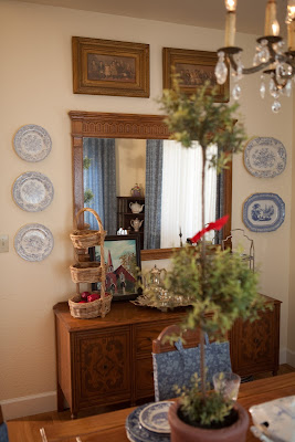
Charlene’s House The challenge of Charlene’s project was blending her existing furniture, antiques, and blue Spode and transferware collections in with the existing architecture and location. We did the house in her fav yellows and blues. The paint was already on when I got there and it was a well chosen shade. The hickory floors keep the place from looking too sweet. I love to have the contrast of a little roughness against pretty elements. It’s that yin and yang, masculine and feminine thing I forever preach about. We chose simple tone on tone fabrics which means basically that the fabrics are patterned but your eye doesn’t immediately see them because they have only one hue. In Charlene’s case the hues are blue or yellow: a yellow on yellow faint stripe; a blue on blue faint floral. I didn’t choose the ticking fabric that is on the loveseats. That was done before I came onboard. The upholstery shop where Charlene took the loveseats had limited fabric choices but no matter. They turned out just fine. I hate waste (and so do my clients!) so we worked with it.

John doesn’t care for the trunk coffee table but he tolerates it for Charlene’s and my sake. They are so good to me! Can you imagine any other type of coffee table in this room? I know it’s a little hard to set a drink down but my goodness it’s gorgeous! The white chair has pale yellow welts that match the curtains. Love the casters. Love the touches of red against the whites, blues, and yellows. Just a little touch here and there. Charlene was born in England and is a true anglophile. Her God Save the Queen pillow and Beefeater gin decanter are perfect reminders of her birthright. The tea set was a great buy at one of our local rummage sales and originally came from the family of another of my favorite clients! The primitive painting of the Episcopal Church of Sonora is by Ron Paris. I love the light fixtures in the dining room, entry, and powder room. John chose them himself and they couldn’t be more perfect. They really help tie together the architecture and furniture style and give the house a little whimsy. A touch of red you don’t see in the pictures is the wood burning stove.

I had to do a little coaxing but one of the best moves we made was removing the dark red Oriental rugs from the living room and dining room. We left the living room floor bare and just added to the dining room a sisal area rug with red trim. I actually like bare wood floors altogether but client’s usually prefersomething under foot.
This house is like perpetual sunshine. It has three large skylights and lots of western facing windows. In the daylight it’s open and bright. In the evening it’s warm and charming. It took some convincing but Charlene finally let me slipcover her little dining room chairs. What a difference! Charlene loves her house and I have immense satisfaction knowing I could do this for her. It’s projects like John and Charlene’s that make my job so rewarding.
")


")

")
")
")